A nutrition coaching practice with real expertise. A brand that needed to make that felt, not just stated.
Nutrionica works with expectant mothers and families at one of the most significant moments in their lives. The brand had to earn trust immediately and hold warmth throughout. Clinical credibility alone wasn't enough. Neither was softness without substance. The identity had to carry both.
There was no brand yet. The practice needed an identity built from the ground up, one that could communicate expertise to a cautious audience without feeling cold, and warmth to an emotional one without feeling vague.
Build a brand identity and web design that positions Nutrionica as a credible, caring practice. Something expectant mothers would trust and families would feel comfortable with.
Start with the relationship at the centre of the work: parent and child. Build the visual identity around that connection. Let colour and typography do the emotional work, so the mark itself doesn't have to carry it all.
Brand Discovery
We mapped who Nutrionica serves and what they need to feel before they book. Expectant mothers are doing a lot of research and a lot of second-guessing. The brand had to answer both the rational and emotional questions before Ana even gets on a call.
Visual Direction
Warm, earthy, grounded. Rich terracottas and browns paired with soft creams and sage greens. The palette references natural nourishment without leaning into the oversaturated wellness aesthetic that dominates the space.
Identity System
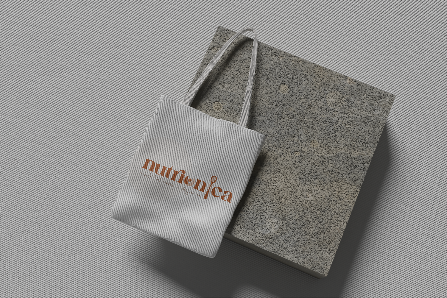
A logomark combining abstract human forms in a circular composition, with a custom spoon element that grounds it in the practice. Allenoire Regular for professional clarity, Graystone Elegant Signature for personal warmth. Each element earns its place.
Credible enough to trust. Warm enough to stay.
The circular logomark holds the parent and child relationship at the centre of the brand. Everything else in the system radiates from that connection.
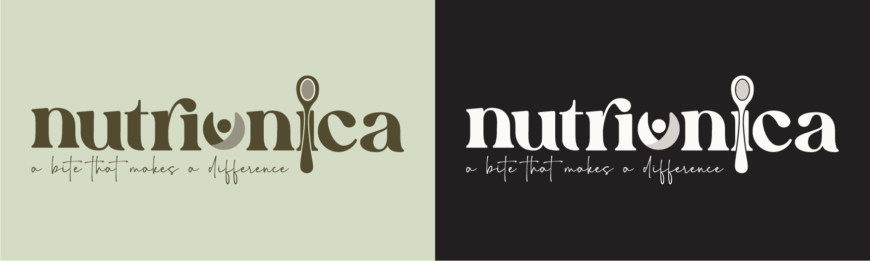
Abstract human forms in a circular composition representing the parent and child relationship. Wholeness, care, and the completeness of that bond.
Grounds the mark in the actual practice. Nutrition, nourishment, and the deliberate act of feeding well.
Abstract human forms held inside a circular frame with an integrated spoon element. Organic and flowing, not geometric or clinical. The mark communicates care before anyone reads the name.
Allenoire Regular paired with Graystone Elegant Signature. Modern sophistication alongside handwritten warmth. The pairing mirrors the dual register the brand needs to operate in: professional enough to be trusted, personal enough to be chosen.
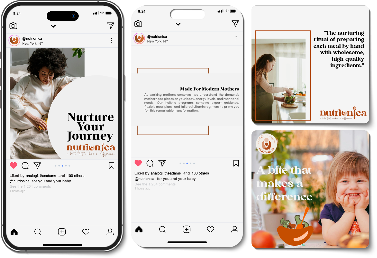
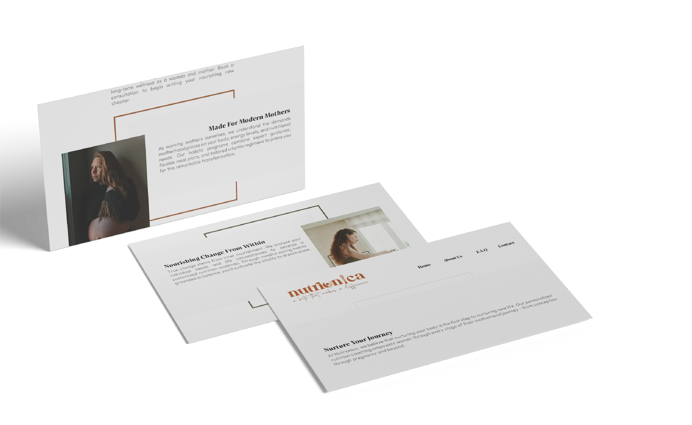
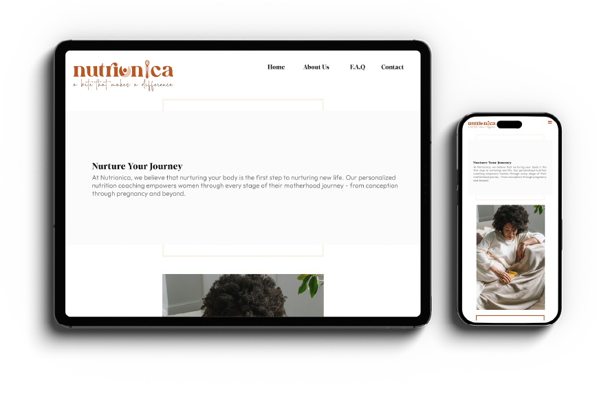
A web design template that captured the brand before the site was built.
Built for the audience
Expectant mothers research carefully and make decisions slowly. The layout, hierarchy, and content flow were designed to support that process, not rush it.
Brand and web in one project
The identity and the web design template were developed together. The site doesn't interpret the brand. It is the brand.
The logo and web design template she created exceeded our expectations in every way. The layout, color scheme, and overall aesthetics perfectly captured the essence of our brand identity. It's safe to say we couldn't have envisioned a better website for our company. Beyond her design talent, Selen's communication throughout the project was exceptional.
A brand and a site that both know exactly who they are for.
Your studio could be
on this page.