A private social club with real depth. A brand that had none of it.
The Social Loft was building something that didn't have a template: a private club for curious, creative professionals to gather, think, and connect. The concept was rich. The existing brand was dark in all the wrong ways. It wasn't communicating sophistication. It was communicating nothing.
The brand was working against them. The visual identity didn't reflect the quality of the experience, the calibre of the members, or the seriousness of what they were building.
Rebuild the brand from scratch. Create a visual identity that communicates what the club actually is before anyone reads a word of copy. Then build a site that makes joining feel like an obvious next step.
Start with meaning. The logo had to earn its symbolism, not just look good. Colour and typography followed the concept. The website followed the identity.
Brand Discovery
We started by understanding what The Social Loft actually stood for. Not just the events, but the philosophy. What kind of person belongs here? What does it feel like to be a member? That clarity had to come before anything visual could.
Positioning & Messaging
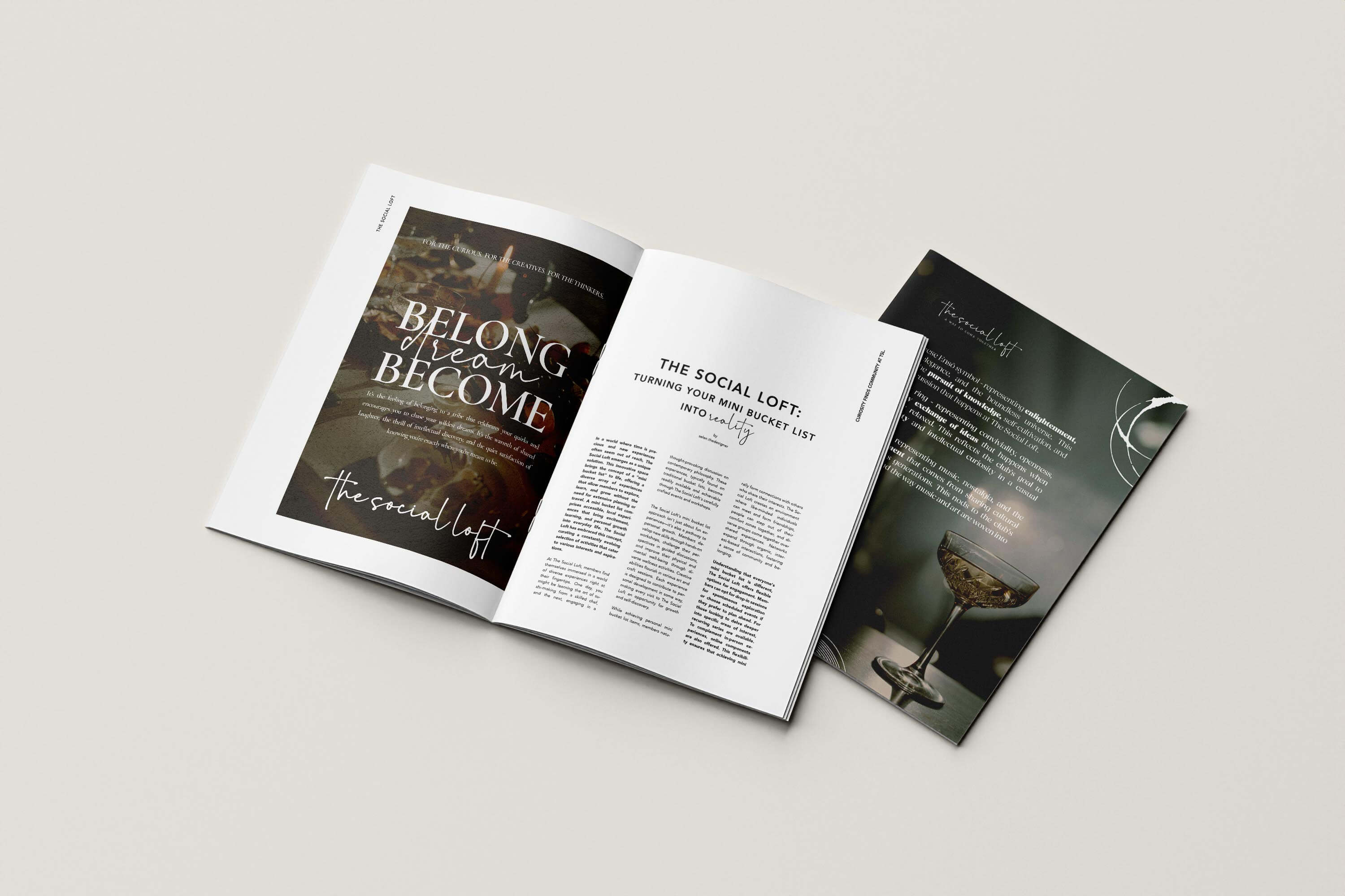
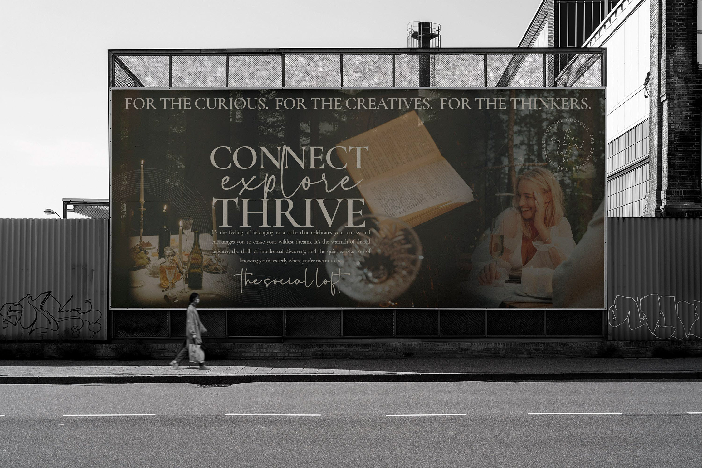
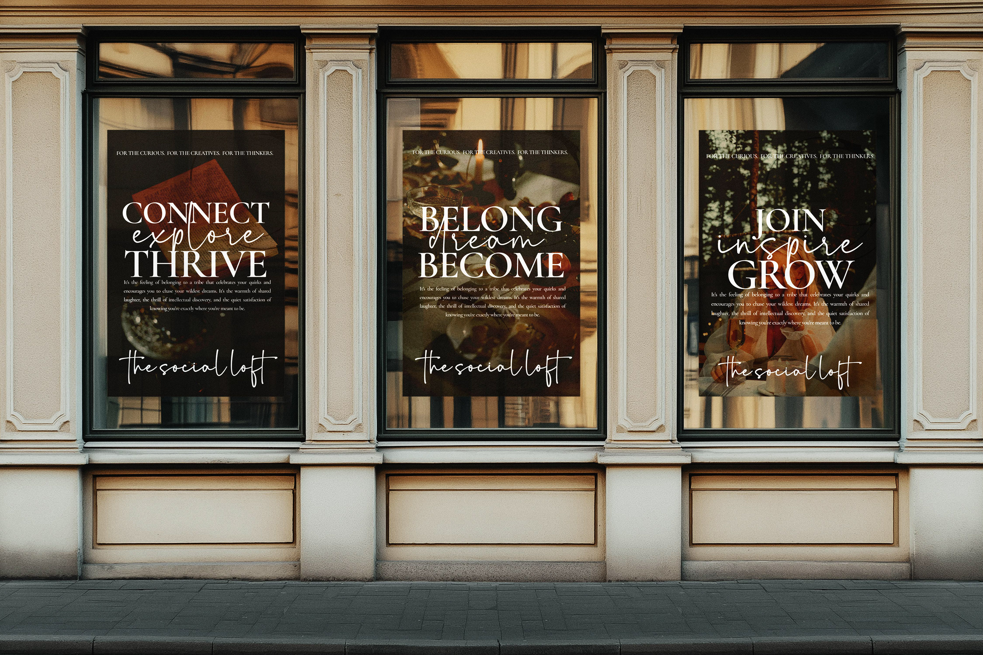
Defined the brand's voice and what it was staking out in the market. Developed the tagline, 'For The Curious. The Creatives. The Thinkers.', and built every message around the idea of curated, enriching experience.
Rebranding Direction
Shifted the brand away from dark and closed to warm, light, and inviting. Sophisticated without feeling exclusive. The kind of visual identity that makes the right person feel immediately at home, and everyone else feel like they're missing something.
A logo that means something. Every mark, every line, every choice.
Three symbols collapsed into one. The Japanese Ensō, a wine glass ring, a vinyl record, each one carrying a different dimension of what The Social Loft is about.
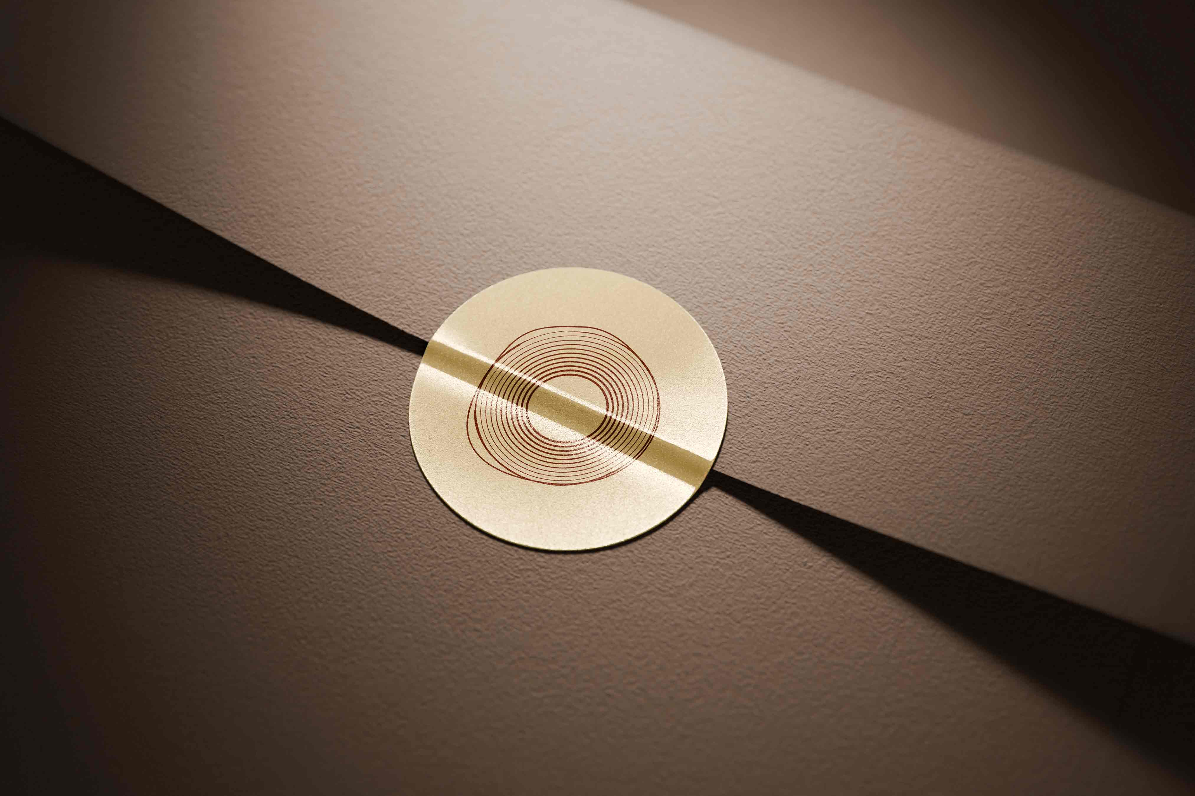
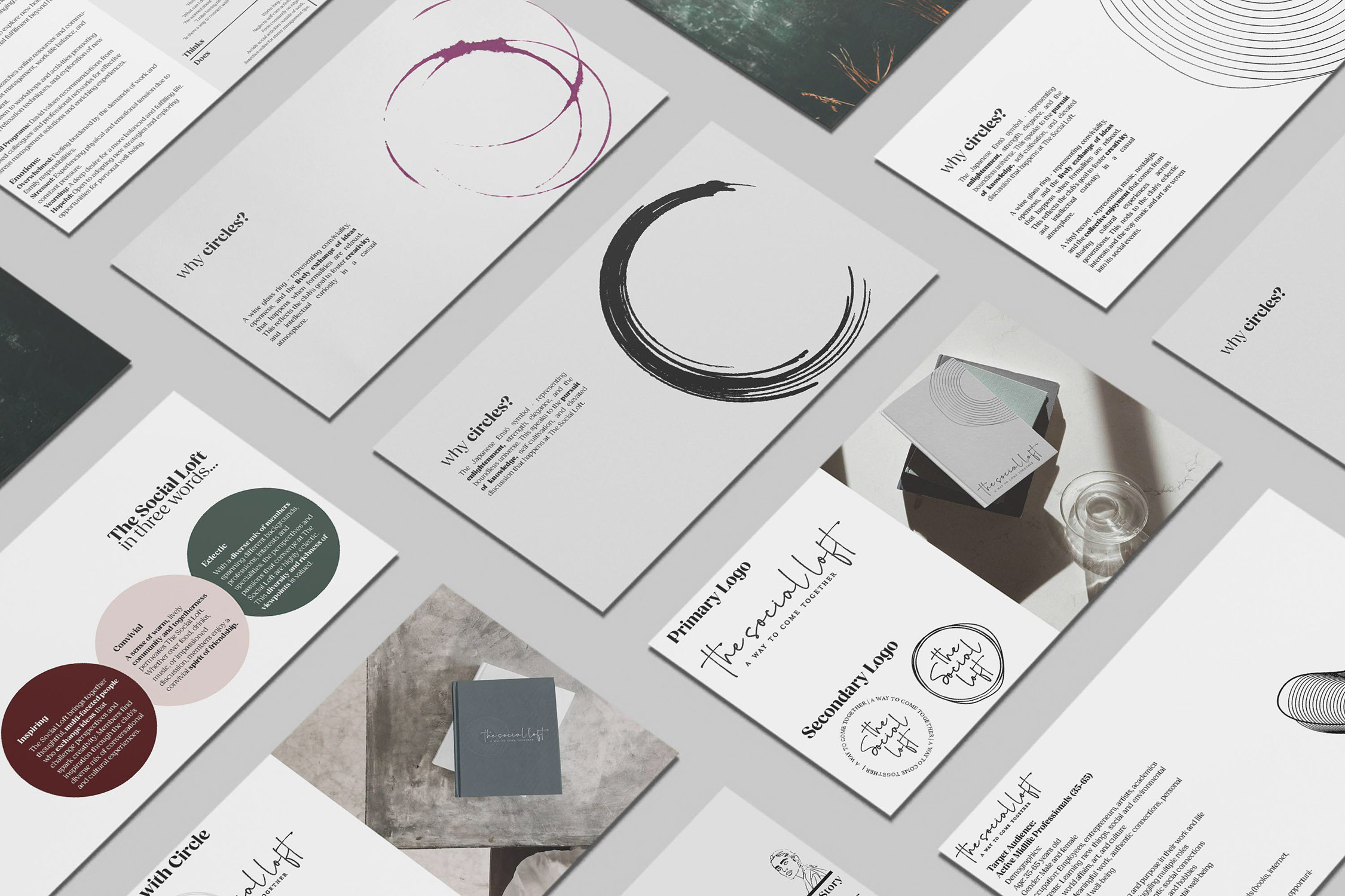
Enlightenment, strength, elegance, the boundless universe. Speaks to the pursuit of knowledge and elevated discussion at the heart of the club.
Conviviality, openness, the exchange of ideas that happens when formalities drop. Reflects the club's goal of fostering creativity in a room that feels more like a dinner party than a lecture.
Music, nostalgia, the collective enjoyment of shared cultural experience. Nods to the club's eclectic interests and the way art is woven into its social fabric.
12 concentric lines representing the 12 semitones of a musical octave, symbolising harmony and completeness. One line breaks from the circle. That's the point. Individuality within community. Growth beyond the expected boundary.
Handwritten-style type paired with clean contemporary letterforms. Warmth and authenticity without sacrificing clarity. The kind of pairing that feels considered, not assembled.
A website that makes joining feel inevitable.
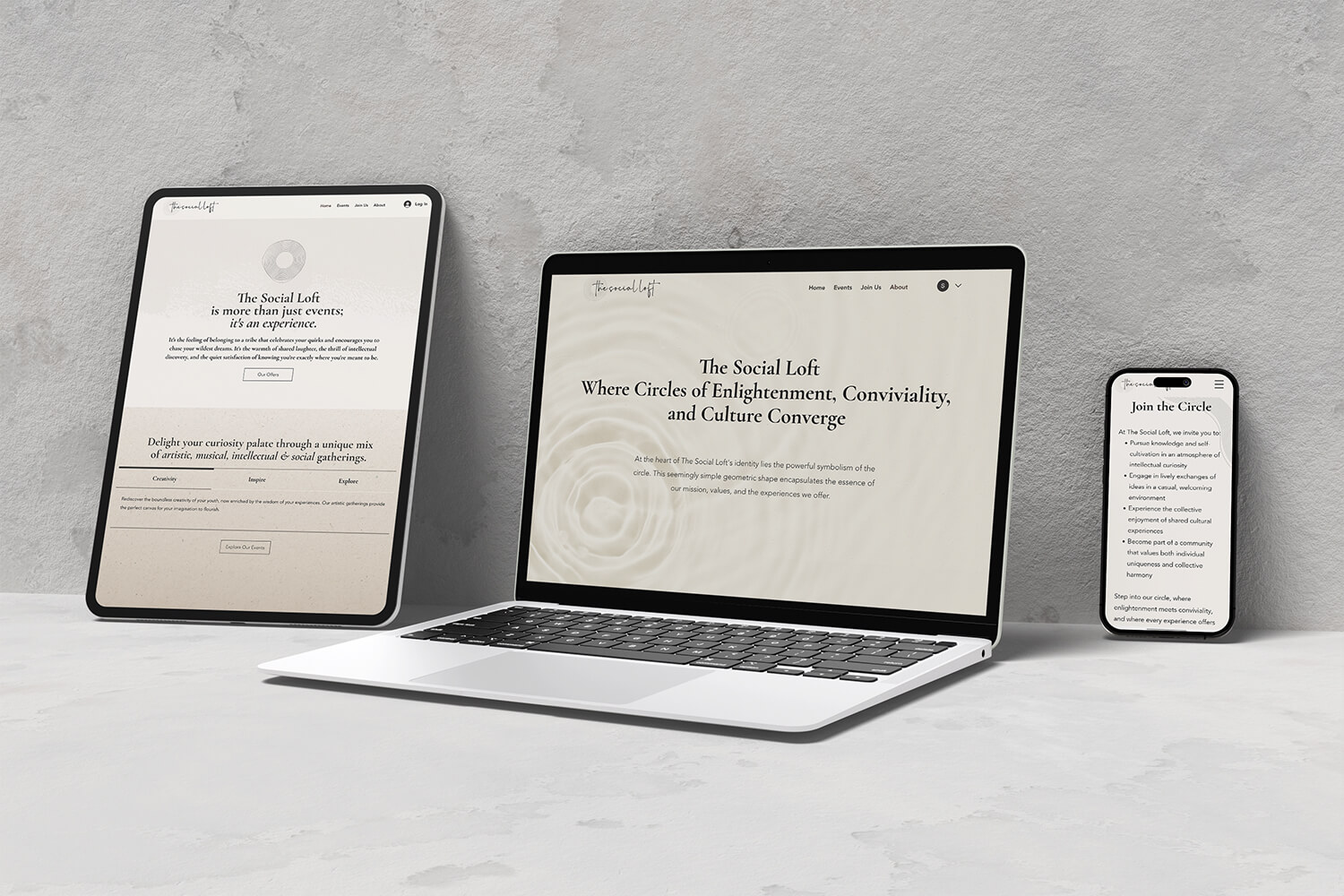
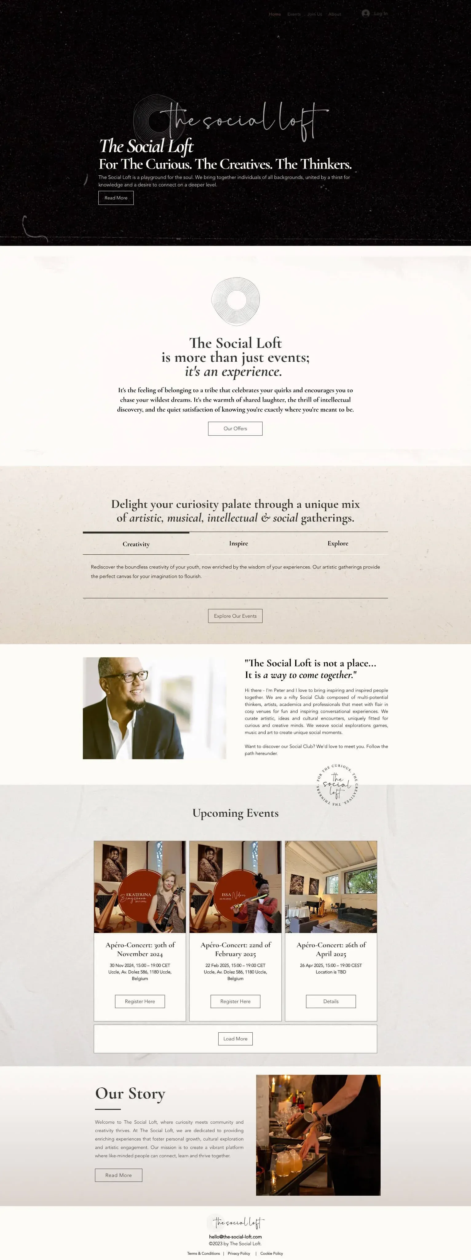
Built around the experience
Events are the product. The site was designed to showcase them, with a clear hierarchy that moves visitors from curiosity to registration without a single detour.
Designed for members
Login, event discovery, and registration. The member journey was mapped and built into the structure from the start. Not bolted on after the fact.
Selen displayed unique talents in listening and helping me identify the core nature of my project and then translating it into impeccable branding and design deliverables. She is also uniquely talented at helping me clarify requirements I wasn't even aware of. That definitely makes her stand apart.
A brand that finally looks like the thing it's describing.
Your studio could be
on this page.