

Branding, Website Design & Development for Quant Landscaping
For Quant Landscaping, we developed a comprehensive brand strategy that transformed their market presence. Starting from the ground up, we crafted their core positioning and memorable tagline, “where science meets nature,” capturing the essence of their innovative approach to landscaping.
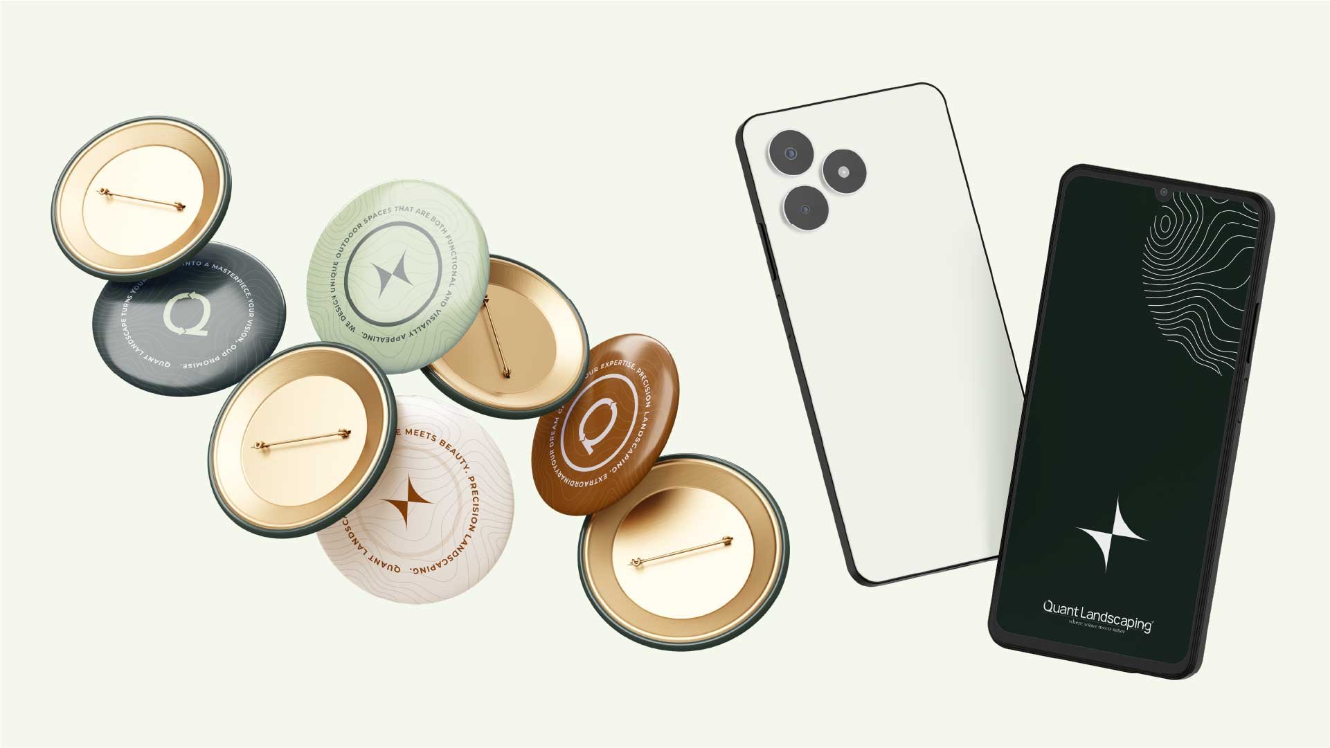
The visual identity system adapts thoughtfully across different mediums. For printed materials and merchandise, custom topographic-inspired patterns create visual intrigue and depth. These flowing contour lines and organic shapes appear on tote bags, uniforms, vehicles, and branded items, subtly referencing landscape architecture and elevation mapping.
The digital presence takes a different approach, letting project photography take center stage. The website design employs a clean, minimal aesthetic with forest green and sage accents that frame impressive portfolio images. This intentional simplicity ensures the focus remains on Quant's transformative landscaping work while maintaining brand consistency through color and typography.
This dual approach results in a cohesive yet versatile identity that resonates with their high-end residential and commercial clients while setting them apart in Vancouver's competitive landscaping market.

Delicate landscape solutions inspired by nature's smallest building blocks
Quant Landscape Services Inc. was established in Vancouver, Canada, in 2019 after eighteen years of experience and is an industry leader in sustainability and environmental solutions. Their goal is to first understand the needs of their customers and provide them with innovative, sustainable, and environmentally friendly solutions. They know that in the 21st century, private green spaces are shrinking and their importance is increasing.


The Quant Landscaping logo symbolises the harmony of science and nature. The letter ‘Q’ in the logo reflects both the initial letter of our company name and the meticulous and detailed nature of our work. This letter is also designed in the shape of an arrow representing a cycle, which shows our commitment to continuous improvement and sustainability.
The shapes in the logo express the beautiful proportions and continuity in nature. Just as everything in nature is harmonious with each other, Quant Landscaping takes care that all elements come together in a balanced way in our landscaping works. In their projects, they both create an aesthetic appearance and offer environmentally sensitive solutions.


Color Palettes


Typograpghy


Web Design: Digital Presence with Purpose
The website design follows a strategic user journey, guiding visitors through Quant's services and expertise with intention. The homepage opens with a powerful yet simple message—"Simplify your outdoor transformation"—immediately setting expectations for both the browsing experience and client relationship.
Key design elements include:
Structured Content Flow:
"Your Vision, Our Promise" section establishes trust and commitment
Service offerings displayed in a clear, visual grid with professional photography
"Our Happy Greenery" portfolio showcases completed projects through an elegant gallery
"The Quant Method" breaks down their process into digestible steps
Visual Hierarchy:
Clean, minimal navigation ensures easy access to key information
Strategic use of white space frames content effectively
Thoughtful balance between text and imagery maintains engagement
Forest green and sage color accents provide subtle branding without overwhelming the content
Interactive Elements:
Client testimonial carousel adds social proof
Special offer sections highlight key services like xeriscaping
Project case studies provide deeper insight into their capabilities
Blog integration keeps content fresh and demonstrates expertise
The responsive design maintains this sophisticated presentation across all devices, ensuring a seamless experience whether viewed on desktop or mobile. Every element serves the primary goal: showcasing Quant's expertise while making it effortless for potential clients to envision their own landscape transformation.

